Tuesday 26 April 2016

OUGD401: Practical Exploration (Evaluation)

This module and the briefs within it are unique to any other module completed within this year so far. Much rather than designing for set design brief such as a rebrand or information design piece, it instead forced me to design for an underlying concept that was prominent within my written essay. An essay that explored a graphic design related topic, which in my case was about brands and consumers.

Exploring the question into more detail and doing in depth research into the actual statistics and theories behind branding and consumers meant that I got a much better understanding of the reasons behind why some brands are more successful than others. This in turn meant that going into designing my practical piece I felt I was much more understanding of what I had to communicate through the practical exploration of my question.


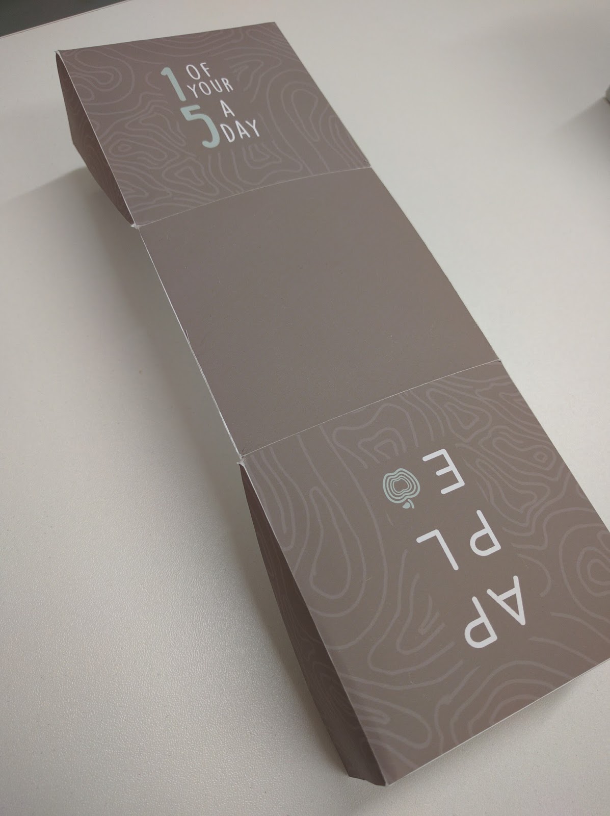
Not only that but the research I undertook informed certain design decisions within my practical piece response to the essay. For example, the study that was conducted with different brands of aspirin that showed how something as simple as clever wording of the product, to make it appear superior to other brands, can fool people into thinking it genuinely is a more effective brand of aspirin. This study lead me to include some clever wording in my final design, using the words ‘natural’ and ‘organic’ made the apple appear in some way better quality even though it is the exact same quality product as something you’d find on the shelves of Asda etc.
I feel as though my final piece is not only related to my written essay but does an effective job of getting across the underlying idea prominent within it. 

The research aspect of this whole process is something I definitely could have improved by doing much more first hand research. Things such as questionnaires would have been useful to find out what people thought about certain types of packaging and whether or not that in some way would have influenced their purchase of a product. 
Questioning people on what aspects of product packaging they find particularly intriguing or eye catching, could have also have been helpful as I would have been able to incorporate this into my practical piece. Doing so could have potentially further underpinned my point within the essay to make, not only the essay as a whole stronger but also my practical piece.

Reading more books of the psychology behind branding and why consumers purchase the products they do would have bettered my understanding of how the minds of consumers work. This in turn would have allowed me to use the same manipulative techniques big name brands use to trick the average consumer into buying particular products.

Feedback Comments:

“The packaging definitely increases the apple’s appeal. The packaging sells the apple as a healthy option, even though apples already are, the packaging further emphasises this through the light pastel colours. These give off an organic look, along with the typeface being light communicating that the apple is healthy.”

“It makes the apple look like a special type of apple. The apple also increases the anticipation of eating it through the way you open up the packaging.”

“It would grab my attention but the way you’ve packaged it makes the product look somewhat expensive which could be a good/bad thing.”

The comments as a whole were very positive and support my idea behind the packaged apple. Not only that it but it also supports my main underlying concept of my whole essay which is that brands have the power to deceive consumers into thinking a product is better than what it actually is through the use of hollow/trigger words such as what I used within the design of the package.

Monday 25 April 2016

OUGD401: Practical Exploration (Photoshoot)


OUGD401: Practical Exploration (Making Of)


Apple Holder


Main Box


Outer Wrapper


After finishing putting together the final product box, there was one or two little aspects of it that didn't quite work as anticipated. The main one being the closing tab at the top, this didn't close fully as shown below. The reason being is that I didn't take into account the extra space needed for the box to rest against the glued tabs on the inside of the 'Outer Wrapper' section. This ultimately meant that there was about half a centimetre between the two sides.


Another problem was because I didn't consider the thickness of the stock when doing test prints and fits, this resulted in bowing of some sides as the box exceeded the size of the base of the outer wrapper by roughly 2mm.

OUGD401: Practical Exploration (Box Design)

Considering the previous brand mark I'd created wasn't entirely fitting to the concept I had in mind, I played around with something more sophisticated.


Using a sans serif typeface placed within a structured rectangle meant that it created a sharp and striking brand mark, as opposed to the soft, playful one from before. Although the element of modern has been brought through with this current logo, I wanted to still incorporate the organic feel I originally set out to have within the design.

As for the arrangement of the letters, left aligned seemed to work the best simply because it seemed more organised and structured than centre aligned.

First thoughts were to use a natural texture along with the current brand mark, something along the lines of a natural wood grain texture but as a line drawing would work to contrast the structured feel of the of the typeface and bounding box.


The only problem I found with this current branding is that the blank space makes the brand mark look incomplete. To solve this I took the aspect of including the vectored outline of an apple and including that within the blank space to bring together the whole mark.


The two options I ended up with was one minimal apple shape, and the other one the same shape, but with the shape layered up to follow on from this grain texture that already is prominent within the branding.

The majority vote after a short conversation with fellow peers was the logo on the left as this had more of a solid feel to it whereas the plain one felt hollow. Also the chosen mark would also do a good job representing the brand on it's own without any typography as it's a distinct and unique mark as opposed to the other mark which is a basic vector apple outline.

I moved onto choosing a relatively light colour scheme that I thought would fit best with the concept and packaging as a whole, especially considering apples are for the most part relatively light coloured.


The colours were mainly taken from a piece of wood to fit in with the natural look, the green was taken from an apple but toned down to become a more softer texture to fit better with the shades of brown. White was taken to contrast enough with colours to catch people's attention without being too sharp to be an eye sore.

Final Brand Mark w/ Added Colour Scheme


Box Sections


There are 3 total parts to the box which will be different colours using the existing colour scheme. This is so that they create a soft contrast between the different sections rather than appearing as a one colour box which may not create that much appeal about the overall look.


The reason behind the boxed off words was to isolate them in the hope to draw attention to them to further emphasis this underlying concept of a premium quality product.


There were certain aspects of the box design that I had to reconsider after a small feedback session with two other peers. Given that I was using 'Moon' typeface for the brand mark because of it's structured and sleek look, I automatically used that for the remaining type on the box designs.

But as shown above, the natural look I was going for didn't fit as well with the actual words 'Natural' and 'Organic' because their literal meaning is portrayed within the visual look of the word. Instead I opted for a more hand written style of typeface called 'DK Lemon Yellow Sun' which was much better suited to portraying the meaning of the words.

Final Box Design


A few extra little adjustments that were made was the addition of the brand logo on the side of the main box so that appear prominent when the outer wrapper is placed around it. Also the grainy wood texture was made slightly more subtle as originally it was too harsh of a contrast and took away from the main branding of the box.

Sunday 24 April 2016

OUGD401: Practical Exploration (Box Development)

Mockup of Net


Apple Holder


Mockup of Box


This piece of packaging appears very natural looking due to the rough textured brown stock coupled with the one colour hand drawn illustrations printed onto it. The inconsistent texture of the illustrations add to this natural look and the minimal coloured wrap arounds make for an attractive and high class design, which is exactly what I'm aiming for with my piece.

Upon reflection, the chosen box design so far doesn't fit as well with my original aim of having something complex and sleek looking. After looking at other package designs and box nets I replicated a net that I think would fit more suitably to my product concept.


The box consists of three nets, the main box and apple holder inner box and then the outer wrapper that wraps around the main box. A box design like this would give a feel of luxury and better quality than the original box I planned on using.

OUGD401: Practical Exploration (Development)

The box net itself is something I wanted to put a lot of effort into as this is the first impression aside from the design printed onto it. A complex and sleek looking box can often draw the attention of the consumer simply because of how they're intrigued as to how it works, rather than seeing a typical folding box.


My initial idea for a box was to have one with a handle to make it easier to handle and to add to the complexity of the design.

Potential Box Layout & Design Sketches


My plan for the style of the design was to combine a simple, modern style with an organic and hand made feel to bring through the quality and production time spent on the product and the packaging.

Each different side of the box would be a different section that tries to emphasise this idea of the apple being different and special, using trigger words. The different sections being things such as nutritional facts, '1 of your 5 a day' etc.

To go with the organic theme, I wanted the branding to match this with a hand drawn style.

Brand Concepts

The brand concepts didn't stand out well enough, they seem too rough and not appropriate. Instead having a sophisticated and modern brand contrasted with an organic, natural looking box design would work much better in terms of creating an effective look.