Sunday 21 January 2018

Final outcome & Evaluation

Final Outcome


The whole project was based upon the essay titled ‘in what ways is there a need for social responsibility in relation to the designer?’. The essay concluded that there is becoming more of a need to define exactly what it is that a designer needs to be conscious of within their everyday practice. Considering design plays a big role in today’s society, there is a big push to ensure ethical practice amongst creatives.

The intention of the practical response to the essay was to reformat how a typical manifesto feels and look in the hope to create a more engaging way to bring about discussion about responsibilities. This was done through creating an interactive website filled with content regarding ethics in the design industry.

Feedback on the final outcome:

“Colour scheme feels neutral which makes it neither negative nor positive in tone of voice. The blue also makes it feel very calming in nature, leaving the user to intepret the website as they feel fit.”

“The typesetting and ragging on the information throughout the website could have been considered a little more”

“There could be potential to possibly add some audio.”

“The gradients make it feel relaxed and smooth.”

“You’re hitting the audience with the design.”

The final outcome for this project could have been improved in multiple ways. There was potential to add a more social element to this by merging in another idea that encompassed a social platform to champion positive social change in the design world. This would have furthered to underlying aim to encourage more discussion about a designer’s responsibilities by actively engaging designers on a day to day basis through this medium. It would also give them the chance to discuss and collaborate on live briefs, again furthering the concept.

End of Module Evaluation

This module like with all previous cop modules has been an interesting one for me. This is because having to do so much in depth research requires a big interest into the topic at hand. Essay writing for me has never been my strong point as I’ve always been a much more visual learner. The level of depth in which this essay had to be made it a big challenge to ensure consistent analytical tone all throughout. I think that the dissertation has been my best piece of writing to date, only through learning from past years of doing did I begin to better understand the structure, ways of research and piecing together that goes into an essay.

Being able to explore and ultimately find an answer to my question ‘in what ways is there a need for social responsibility in relation to the designer?’ was very rewarding, especially considering the copious amounts of reading and writing that went into the essay. This is one subject that I feel given the chance I would want to explore into more depth as I feel there was a lot that I missed out upon by not taking advantage of it at the time. The fact that this subject is so in depth that there would be ample room to continue reading and writing and ultimately creating a response to this question.

Although I’m happy with the outcome I feel as though there are a couple of ways I could have improved this module. Doing more first hand research definitely could have helped in developing and supporting my ideas and arguments both within my essay and then my practical piece. Methods such as interviews and questionnaires could have helped a lot more in finding out in today’s times people’s thoughts and views on social responsibility itself as opposed to purely relying on books from past times. I think also exploring my initial ideas in more depth before settling for my main idea could have helped in broadening my horizon as far as final outcomes go.

Ultimately, the module as a whole has helped to better my interest in not only social design but in research based design as a whole as having an extensive amount of research helps to justify every design decision.


Saturday 20 January 2018

Creating an animated website

Creating from scratch a responsive animated website would have been quite tricky, especially considering the time constraints so instead I used After Effects to create a smooth animation that navigated the user through the website to show what it involves. Using my stills from Adobe XD, I created a flowing animation that shows the website in full effect.

Friday 19 January 2018

Working on the interactive element of the website

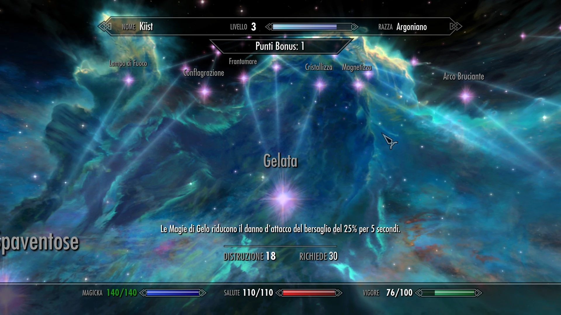
One thing that sprung to mind when I thought of creating this network was an old game I used to play called The Elder Scrolls V: Skyrim. It was an open world action role-playing game that allowed for the individual to work on upgrading their character. One element of this upgrading system was a skill tree (shown below) that was set in a 3D space much like I envision my website to be like, multidimensional.


Quick video showing the perk tree in use


The way you're able to navigate in this game is similar to how I want to users to be able to navigate the website. I also want to create a sense of depth much like the game has, where there's a multiple levels of responsibilities.


Responsibility Tree

The majority of my content for the site is contained within the tree above, each of these sections have information contained within them that explains the responsibilities in more detail.


I used a simple sans serif typeface (Gotham) as I feel this nice balance between not looking too structured but also not too playful. As for the colours used, I chose to go with gradients in the hope this would add character to the individual pieces as opposed to just block colour. The use of gradients also adds to the spherical look that I'm aiming for.


One comment made was that the lightness of the background retracts from this sense of depth that I'm aiming for, so as a change I change the background to a darker shade.


Initially the abundance of colour gradients within the site were said to be a bit too overwhelming so instead I simplified it down to basic colours that would work better in conjunction with each other and also the background. Having different colours for each piece within the site makes for more individuality between responsibilities.


When the user visits the website they'll be presented with a welcome screen (or welcome back, depending on if they are logged in already); from here they will be able to explore the network freely.


A little about page to give the website some context.
The plan is to create an animation that navigates through this website to give the user an idea of how it will work.

Basic design concept for website

Going with this idea of creating a 'network of ethics' I started to think about how this could work with the content I've already sourced. Given that a lot the responsibilities I aim to include are more in depth that just a simple sentence, I thought that the network could consist of these bigger circles that would contain titles for each responsibility then from those would stem the individual components that make up that responsibility.


Since there is much more information than what meets the eye, I thought that something simple as to hover or click a circle would bring about more in depth info by zooming in and revealing more detail.


Below are quick greyscale outlines of what I imagine the site to look like. The site is currently labelled 'Network of Ethics', although this could be subject to change as it was just a quick thought.


Inspiration for this idea came about in the form of star constellations, the way these interconnect with each other brought about the idea of how all of the responsibilities in some way interconnect also to become something much bigger than any one would on their own.


Quick logo ideas

Although the brand isn't the main focus of the idea I still needed something that create a visual brand for the website, much like any other website. With my first initial sketches, I thought of keeping the logo modular so that it could adapt to it's environment, much like the network itself adapts to the user when in use.


Ideas 4 and 6 worked off the idea of building blocks, with those individual blocks representing an individual piece of information coming together to form something bigger much like the network itself.

Ideas 1,3 and 5 were based off the look of the network of ethics itself with it's interconnected lines that join together the separate parts. It also means that the the separate letters N, O and E can be adaptable by having the freedom to move wherever they please, again adding to this idea of having a modular logo.


I decided upon logo 4 as the sharpness of the boxes contrasted nicely with the abundance of circles within the webpage whilst still retaining this underlying concept of being modular.
Welcome Screen


Main Page


I chose to go with a soft, light blue colour simply because this is a chilled, calming colour and it's this tone that I want the website to follow by; nothing too demanding or too harsh.

Thursday 18 January 2018

Dissertation and Practical Synthesis

The whole essay was exploring social responsibility in relation to the individual designer and whether there is a need for said responsibilities or not. Design plays such a big role in the world today and has such an influence on people that it’s often questioned how socially conscious are these designers that are outputting their ideas into the world that could potentially have a psychological affect on their audience. As Prasad Boradkar mentioned ‘the responsibility of the designer and his/her work should extend beyond issues of form and function to those of society and culture’, thus emphasises the need to define the responsibilities it is that a designer should possess. The points that were made within the essay supported the idea that designers should be more conscious within their everyday practice, as to think more thoroughly about the social, environmental and psychological impact their work will have on the outside world.

One main way that individuals or groups in the past have tried to define exactly how it is designers should behave within their practice has been through the use of manifestos but these aren’t always successful as they’re often too idealistic or not concrete enough. Other issues mentioned by other students regarding manifestos, were that they are usually tedious to read and aren’t engaging at all. Considering that the target audience for the practical piece is that of the younger generation of designers, this was problematic. So the idea was to reimagine how a manifesto is both designed and distributed, in the hope to engage and bring about more interaction with the content of the manifesto and ultimately align themselves more with the ethics that come with designing.

Much like the EU Paris Agreement has done for the physical wellbeing of the planet, the idea was hopefully a step in the right direction towards the social and psychological wellbeing of those within it. By equipping designers with the necessary information to ensure ethical and correctly conducted practice and by setting off young designers on a good foot for the remainder of their careers.

Feedback for the idea revolved around the general consensus that structure of a manifesto and even the word itself felt outdated. To tackle this the idea was an attempt to bring the manifesto into the digital age by creating a website that reformatted the typical content of a manifesto but in a more interactive way. By using the format of a website it meant it was a much easier and cheaper way to promote the content without the need for producing any physical material that is only contradicting the idea of maintaining a sustainable ethos in everyday practice.


The final piece itself was an interactive experience created through the format of a website that allows individuals to explore the responsibilities of a designer in the hope to bring about more discussion amongst individuals regarding ethics. The format was chosen due to the endless visual and explorative possibilities that could be used to present my concept.