Sunday, 23 April 2017
End of module evaluation
Overall I feel as though my essay was strong and in depth into the world of consumerism with a practical response that could have been stronger in some areas. I think that the practical could have been developed more into a bigger concept than what it was. I enjoyed going more in depth into consumerism and the psychology behind it and that this helped me to get a better understanding personally of why we consume and on such a regular basis. I think my essay writing skills have developed a lot since last year with a much more improved structure from CoP 1 and better understanding of references. Reading a lot more books and research studies helped to better create a solid base of knowledge about branding, advertising and consumerism on the whole before going into my essay. I feel that I had a range of ideas for my practical that could have been expanded on a little more, but I think my practical response was appropriate to my essay.
Final Outcomes


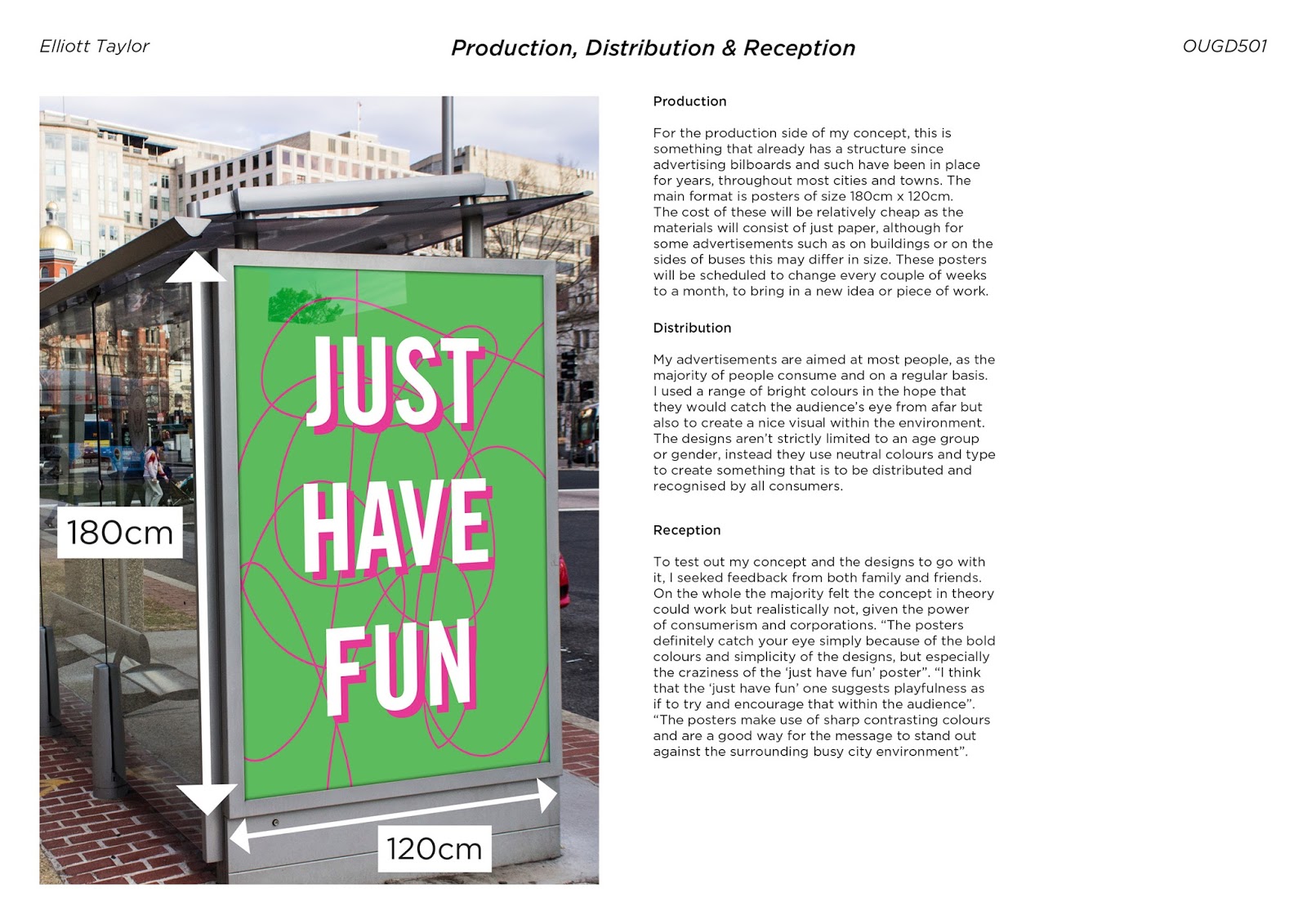
I chose these messages as I feel they're something that people could respond well to whilst also in some way boosting moods and evoking happiness. Having these out in the streets typically where advertisements would be could prove more useful rather than being bombarded with products. Although these are portrait they could be adapted to fit landscape or other forms of advertising throughout the streets.


Although these are just one set of posters, essentially one project in the grand scheme of the public space idea, the concept is to change these around to something new and interesting every couple of weeks. The content would be dictated by the public who will make suggestions individually or as a group of people who maybe want to get a message across or just to display artist's work to the public.
Public space - For the public
After creating a couple of rough visual ideas for my concept, it dawned on me that it could potentially become repetitive long term to have this running theme of uplifting/positive messages, it feels more like a short term art installation maybe. Considering that the idea behind this piece is to someway improve individual and societal well being and happiness, this can be done in a lot more ways that one and the space that would usually be occupied by adverts is the perfect, well regulated amount of space to do so. Advertisements are ubiquitous which means take them away and there is an awful lot of blank space to display much more important things, ideas, concepts than that of just promoting a consuming way of life.


This is where the idea of public space for the public comes in, given that these advertisements are out in public space, they aren't actually for use of the public instead just for corporations to promote their new product most of the time. But not all ads do this, some of the time there are government ads that inform the public on new incoming laws/changes to society also things such as health awareness schemes etc. which I think are necessary and is why these would would still form part of this public space idea.
This would be a chance for artists to display more of their work out in public, it would give anyone the chance to propose an idea to display something in public without needing lots of money to do so as you normally would. These in themselves could give people a voice to get thoughts out there, to evoke emotion through work to the public without having to specifically go to an exhibition.
The easiest comparison to make is in a way similar to graffiti, except a legal version of this. Although some graffiti doesn't always serve a purpose, a lot of it can actually send out positive messages such as within the examples below.


Advertising positive/thought provoking messages
After speaking to a couple of classmates about my visuals so far, a suggestion was to take the structure of a typical ad, e.g. McDonalds and use that to structure the content. This way, although I've already used the same colours and typeface from the McDonald's ads, having the same layout will give it more recognisability.

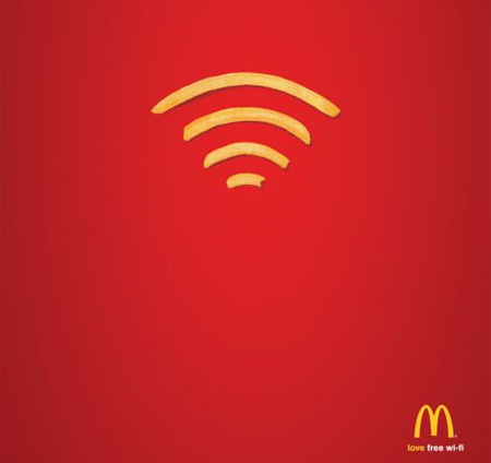


I kept the text yellow, simply because it's more recognisable than having white text within the ad.
A point that was made about the poster is that although the message makes sense, it might not always be taken into account, people may see it and possibly think 'yeah i already know this' and dismiss the advert. A solution to this could potentially have messages that evoke the feeling that's trying to be conveyed within the messages but to not directly say it, or at the very least put the message across objectively.
 |
| Aiming to evoke happiness |

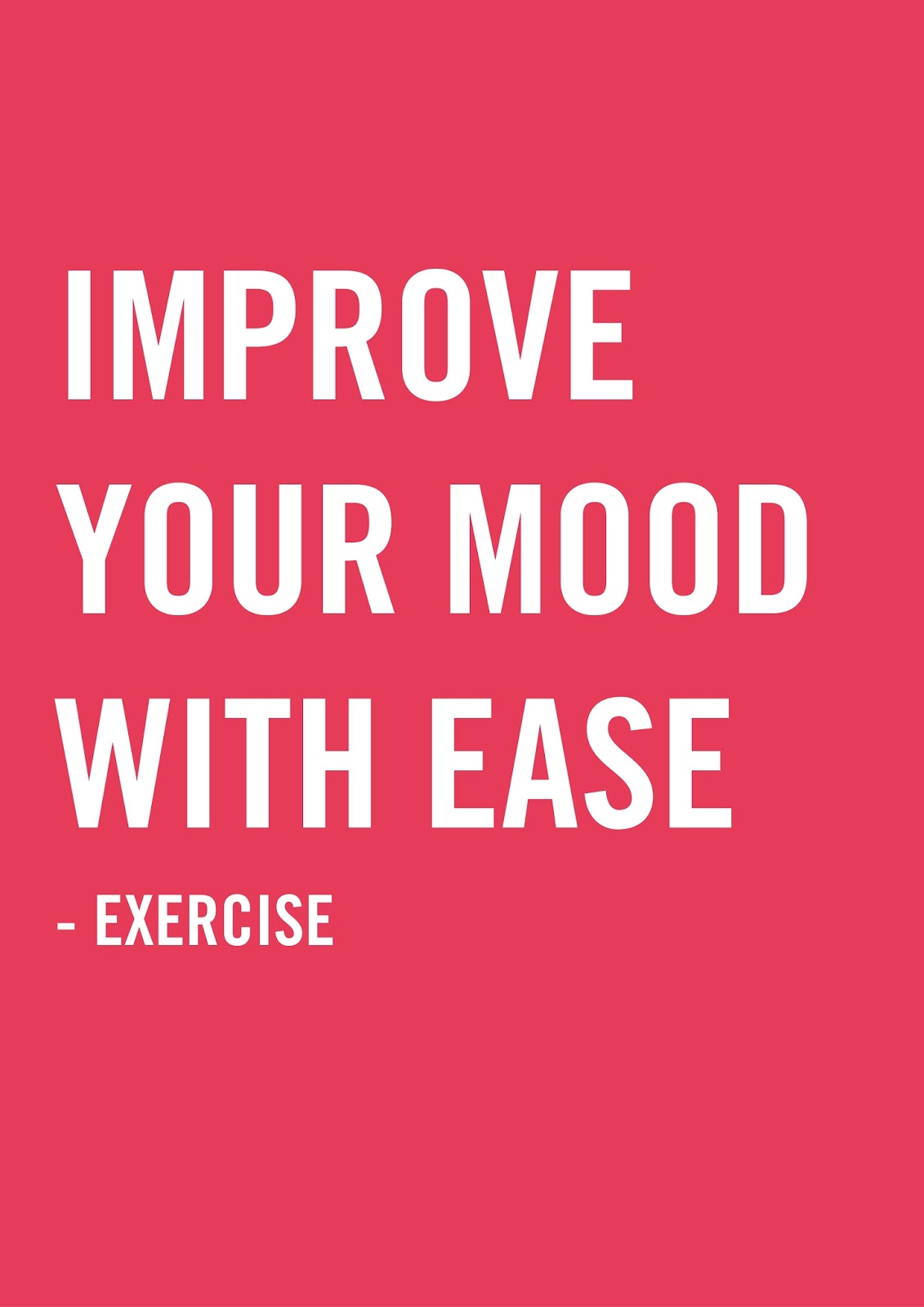
The second example I was aiming for more of an objective wording on the benefits of exercise as opposed to saying 'exercise is good for you, you should exercise' sort of thing. I instead stated it more as a fact hopefully in an appealing way to the audience.
Change of direction (again)
I began to develop this idea of a brand and it's blank advertisements only to realise within a discussion with some friends that I had a much stronger idea from the very beginning that I didn't choose to follow through with for whatever reason.
The idea to take the format of advertising (so the traditional advertising methods with bill boards, on buses and such) and to use it to communicate positive/thought provoking messages or useful information that people would benefit from. Topics such as exercise, meditation, the environment, something along those lines. Because I think the format of advertising is useful and considering they are everywhere, people will see a lot within a day.
I think that this tackles the problem I posed to begin with of advertising promoting products in an unethical way and instead can be used to communicate more useful messages than those just of consumption. All of this would hopefully promote happiness and lighten up people's days, rather than to decrease it by degrading people's self worth through photoshopped models/ celebrities on bill board posters etc.
My first thoughts on how I could visually represent this is by using already commonly seen colours and typefaces used from brands to grab the attention of passers by, but the content would instead be positive/useful messages.
A perfect example of this would be from Stefan Sagmeister's talk Happiness by Design where he shows an example of a friend's piece of work that does a similar take on this idea. A group of designers overruled the usual subway instructions. They replaced the typical informative posters with posters that evoke genuine happiness, posters with a funny side to them whilst retaining the same design as the previous posters. Typically the posters would have been boring but although the format of it stayed the same, the content changed to be something interesting and funny.


An example of how I could present this would maybe to use the attractiveness of ads that already work by this I mean take the bold, striking colours of existing ads and use them to my advantage such as McDonald's red and yellow for example. The same goes for typefaces, using Nike identifiable typeface to catch the attention of passer-bys that would typically think it's an advertisement and will instead take in the positive message it's stating.
Colours
Typefaces


The idea to take the format of advertising (so the traditional advertising methods with bill boards, on buses and such) and to use it to communicate positive/thought provoking messages or useful information that people would benefit from. Topics such as exercise, meditation, the environment, something along those lines. Because I think the format of advertising is useful and considering they are everywhere, people will see a lot within a day.
I think that this tackles the problem I posed to begin with of advertising promoting products in an unethical way and instead can be used to communicate more useful messages than those just of consumption. All of this would hopefully promote happiness and lighten up people's days, rather than to decrease it by degrading people's self worth through photoshopped models/ celebrities on bill board posters etc.
My first thoughts on how I could visually represent this is by using already commonly seen colours and typefaces used from brands to grab the attention of passers by, but the content would instead be positive/useful messages.
A perfect example of this would be from Stefan Sagmeister's talk Happiness by Design where he shows an example of a friend's piece of work that does a similar take on this idea. A group of designers overruled the usual subway instructions. They replaced the typical informative posters with posters that evoke genuine happiness, posters with a funny side to them whilst retaining the same design as the previous posters. Typically the posters would have been boring but although the format of it stayed the same, the content changed to be something interesting and funny.


An example of how I could present this would maybe to use the attractiveness of ads that already work by this I mean take the bold, striking colours of existing ads and use them to my advantage such as McDonald's red and yellow for example. The same goes for typefaces, using Nike identifiable typeface to catch the attention of passer-bys that would typically think it's an advertisement and will instead take in the positive message it's stating.
Colours
 |
| McDonald's Key Colours |
 |
| Pepsi's Brand of blue |
 |
| Coke's Distinctive Red & White combination |
Typefaces
 |
| Adidas' Brand Typeface |
 |
| McDonald's Typeface (Best Guess) |
 |
| Nike's Brand Typefaces (Old&New) |
The messages within these advertisements would be positive ones or ones that provoked some sort of response within the person to think about. A couple of topics that came to my mind that I feel everyone could benefit from knowing the benefits about was meditation and exercise.


Rather than telling people what to do and stating the benefits, instead I think that wording it in such a way that sounds more like advice would be better received by the audience. By using purely typography I feel like a strong message can be communicated when combined with bold colours and common, recognisable typefaces as previously mentioned.

Following the usual combination of red and yellow of McDonald's plus their usual typeface used within ads, it will hopefully catch the eye of the audience whilst communicating an important message that would contradicts typical advertisements.
Thursday, 20 April 2017

Thoughts on my new idea
From the feedback session I got the suggestion to revert back to one of my older ideas of 'Blank Advertising' but with some changes, that being the fact that I would create a new brand to advertise for that would have no previous associations with it. All of this would be done to take away the influence both the brands themselves and their advertisements have on us as the consumer.

As examined within my essay, the Coke advertisement 'open a Coke, open happiness' is an example of an advertisement that uses clever catchy slogans that promote the idea that this product could improve your life in some way (Leonard 2010). I've noticed that there is a reoccurring theme throughout the fizzy drink advertisements, which is that they all suggest ideas of improving your life in some way or another. As the Pepsi ad below directly says 'Refresh your world', suggesting that the Pepsi drink could do exactly that. It's for this reason that I think producing a new brand of drink(s) but using this style of 'Blank Advertising' could be a good way to set an example, not just to other drink brands but also to other product brands.


The Coke ad below also plays on our needs of companionship by suggesting to share the drink with friends and family, creating an association of lovingness that would normally shared amongst family and friends now associated with Coke.

Sources:
Leonard, A. 2012. ‘The Story of Stuff. New York: Free Press. 149.

As examined within my essay, the Coke advertisement 'open a Coke, open happiness' is an example of an advertisement that uses clever catchy slogans that promote the idea that this product could improve your life in some way (Leonard 2010). I've noticed that there is a reoccurring theme throughout the fizzy drink advertisements, which is that they all suggest ideas of improving your life in some way or another. As the Pepsi ad below directly says 'Refresh your world', suggesting that the Pepsi drink could do exactly that. It's for this reason that I think producing a new brand of drink(s) but using this style of 'Blank Advertising' could be a good way to set an example, not just to other drink brands but also to other product brands.


The Coke ad below also plays on our needs of companionship by suggesting to share the drink with friends and family, creating an association of lovingness that would normally shared amongst family and friends now associated with Coke.

My aim is to create a no frills brand that promotes what the product is and nothing more, promoting it based upon what the drink is. The advertising to go with it will be blank, only showing the product as opposed to using slogans, endorsements etc. to sell it to consumers. Almost like in a way turning a new leaf in the world of advertising, a fresh start.
Sources:
Leonard, A. 2012. ‘The Story of Stuff. New York: Free Press. 149.
Feedback
I presented my current ideas to a crit group to get outside opinions and views on how plausible and logical my ideas are at this moment. Although there was no huge criticism to my current idea of having one consistent clothing line, there was a couple of suggestions for potentially expanding some of my other ideas.
One idea was to potentially sell products by their purpose as opposed to by their brand. So for example running shoes rather than having the Nike swoosh would just be branded as running shoes as their most basic form.
Another idea and one that I think will work to emphasise my point the best is to take my idea of 'blank advertising' and to start completely fresh. The issue I originally had with my ideas was that although there was no background noise that would influence the consumer in some way e.g. celebrity endorsements, the brand itself still has associations with it that would influence the customer in some way. So the idea instead is to create a brand from scratch that would set an example for how advertising could potentially be more ethical by displaying the products as opposed to selling them. Creating a brand from fresh would mean that there would be no previous associations to the new advertisements like McDonalds would have already for example. Instead it would be a clean slate to make an example to the advertising world of how it could be done in a much more ethical way, a way that doesn't glorify consumption.
One consistent brand & results from questionnaire
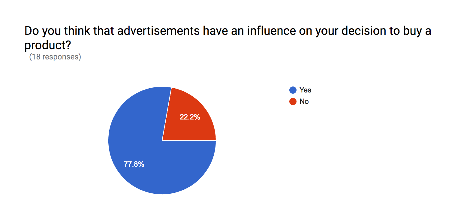
To try and understand more about my audience and their thoughts on branding the influence it has on us, I sent out a short questionnaire asking for people's opinions.


A lot of the responses suggested that brands are a key factor in deciding what product to buy for people. Considering as well the majority (83%) of the people answering were young (between the ages of 18 and 29) it's safe to assume that a lot of people are bothered about what brands they were and how these represent themselves. More specifically clothing, after asking a couple classmates what products in particular they bother with the brands about it was what they wear. This is something I think is prevalent today especially within younger people, the brands of their clothes are most important. I think this is what I could focus my attention on as I feel it's a much bigger issue as it's linked to people's own personal identity and how they look.
The main reason for their choice of considering brands when they shop is down to the quality that is associated with that brand that they've experienced from past times of shopping with that one brand.
The issue I have at this point with my idea is that the brand itself still in some way influences the consumer, even when the advertisements are stripped back to it's bare essentials, the product and brand name. But from the results of the questionnaire, a big reason why the brands are chosen over others is because of the associations with them, a big one of those being the quality of the brand.
From this an idea stemmed, if I was to hypothetically eliminate clothing brands and instead create a system in its place based around the quality of the clothes. In the same way that if you wanted a pair of jeans that don't cost the earth knowing they would be lower quality, you would maybe go to Primark or H&M but if you wanted a nicer, higher quality pair you'd maybe go to Levi's or All Saints. I think instead possibly having a number system 1-3 of the quality level this would eliminate the brand influence it has on people. Instead they would be purchasing clothing for a reason, not for the brand; either the cost that they can afford or the quality that they desire.
For Example:
1: Best Quality - Expensive
2: Good Quality - Mid range price
3: Average quality - Cheap
A problem with this that was pointed out was that there would still be the level of judgement between peers that there is currently with people aspiring to wear the better, more expensive brands that their friends might have and vice versa, those people looking down on others for wearing cheaper brands.
Instead an idea that was put forward to solve this was one clothing line for all, all consistent pricing and with that consistent quality that people would normally buy particular brands for. The styles of clothing wouldn't be any different to how it is now, the difference would be is that there wouldn't 5/6 different brands of the similar style jeans, instead it would be one non-branded pair of jeans just in different styles and colours e.g. black, blue, grey. Ripped, skinny, slim, boot cut etc. This eliminates the need for brands whilst still providing the quality that people want from their favourite brands. It would also hopefully reduce the judgements that people impose on other people for the cheap brands, low quality clothing which is seen as less desirable to most.
Subscribe to:
Comments (Atom)